Year
2022
Product
Virgin Red loyalty web and app
Onboarding Journeys and Preference Settings
Solving problems of un-engaged users and allow personalisation
We discovered problems where there was a low engagement rate for users who first joined. I investigated further and through user research, we found that users didn't know what to do next upon signed up, and led to low numbers of users engaging in earning and spending points with our programme - which was the main revenue driver of our products. I designed an onboarding journey to solve the problem and aimed to educate the users. There was an opportunity to improve the relevancy of the inventories for different users. This was an ongoing issues and with my understanding of the products and our users, I designed the journey of preference settings to further development of personalisation of our products.
Target users
Users who are signing up for the first time
Insights from research
Users want personalised content when they get into the app.
Users want to have more information about the app especially how they earn points and what benefits they have for using the programme.
Users needs help for their first activity on the app.
Project goal
Design the onboarding journey for our loyalty app so the users could have an engaging and informative experience when they first interact with our app.
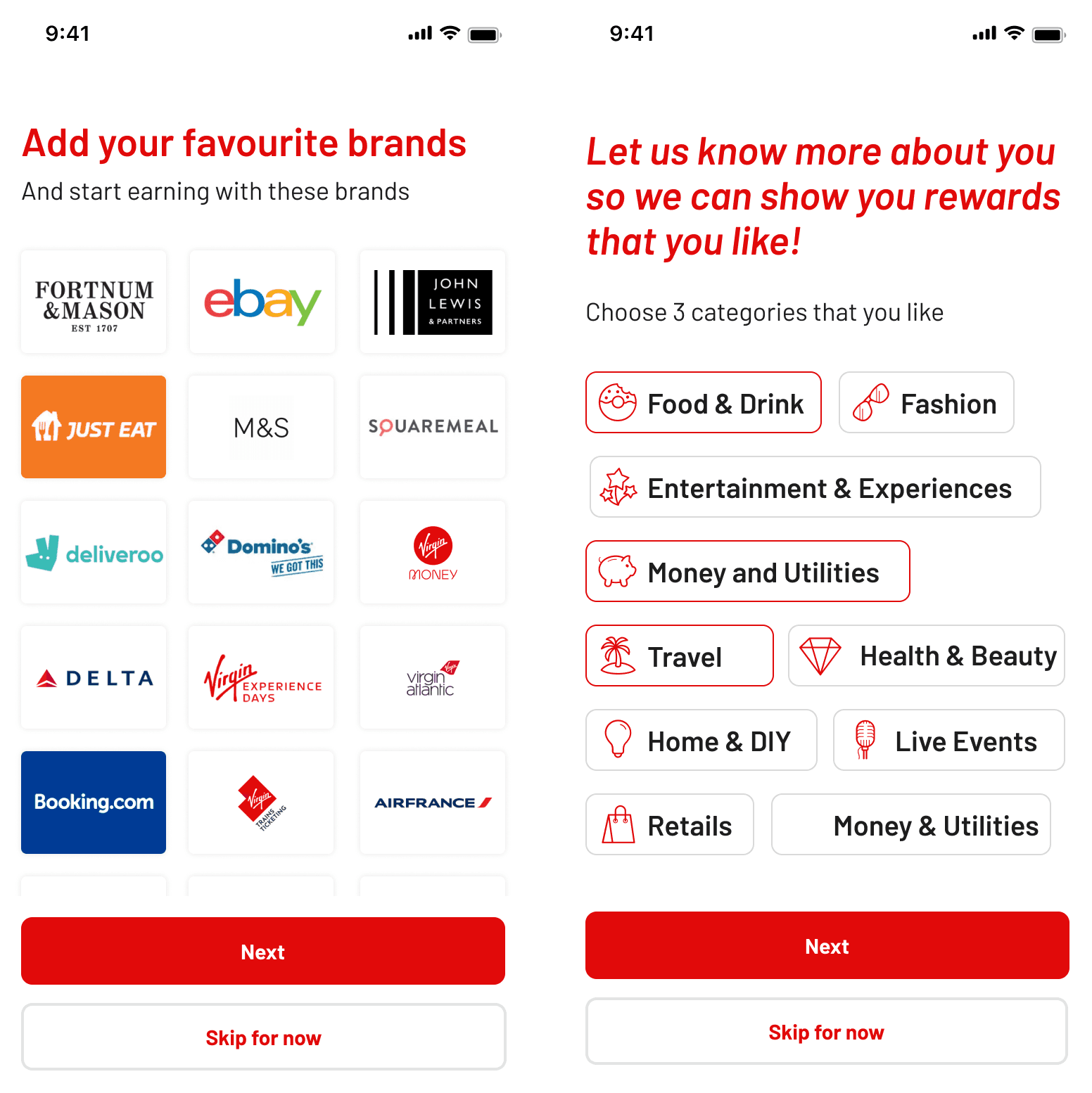
It also gives them opportunity to set preferences for personalisations to provide more relevant and engaging experience.

Original onboarding did not serve the purpose for educating the users and need to work harder to help our product stand out

Setting preferences allows us to understand the users better
Through collaborating with the Data Science team, we use categories and brand preferences which could help us to personalise the content.
We used survey to get an understanding of the users appetites on choosing on their own preferences, they found it appealing and help them feel empowered and in control when given with these choices.

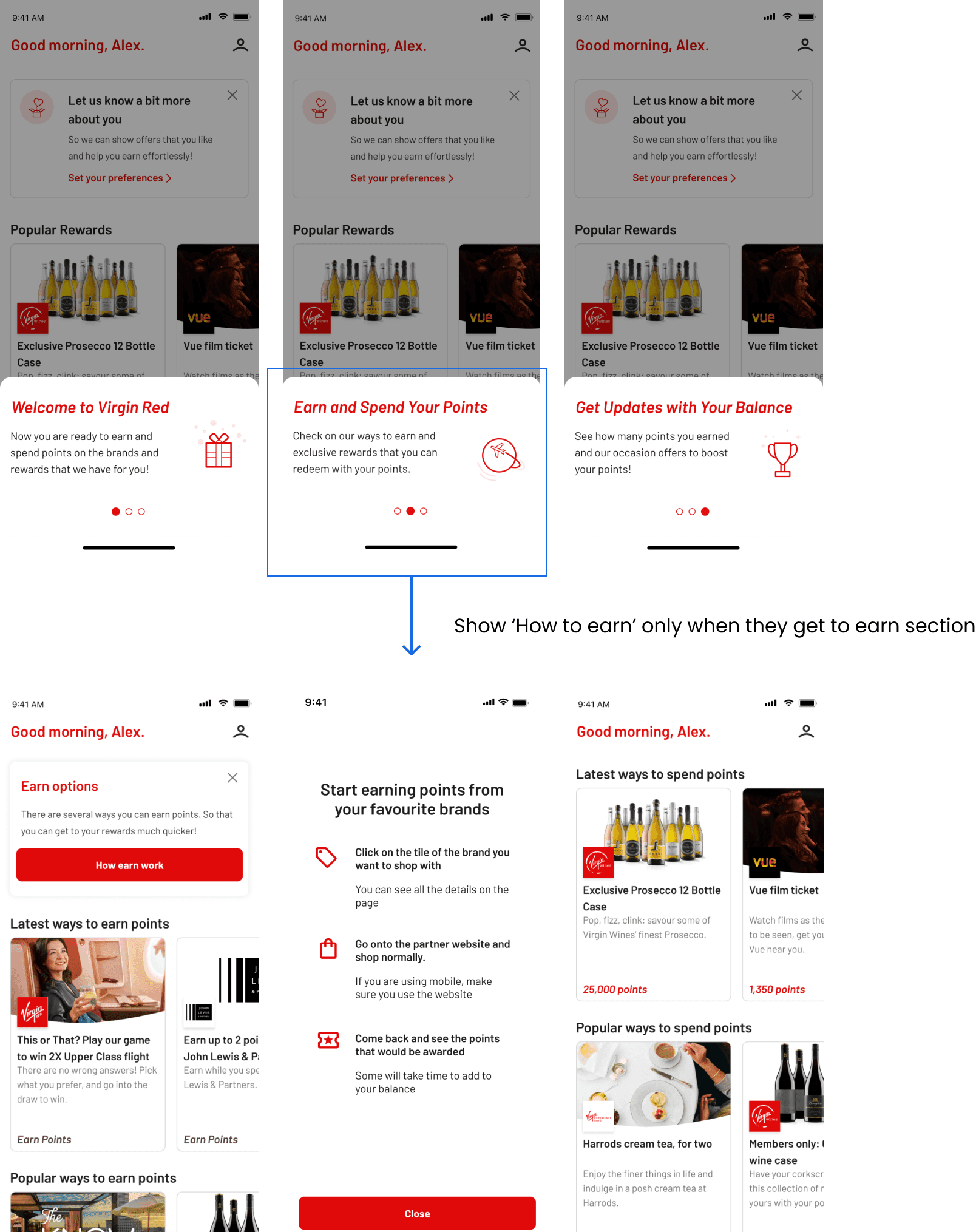
Onboarding content card
• We aims to design these content card so they are engaging and easy to read.
• It tells the high level of what Virgin Red is and the benefits.
• It tackles one of the main painpoints of the users of not understanding how Virgin Red works.

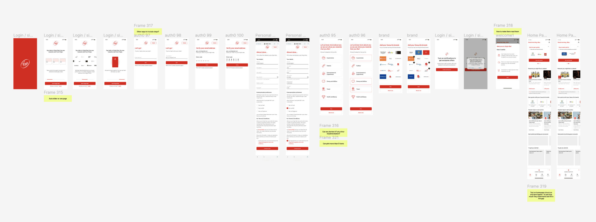
Sequence of the onboarding journey
• We found that users receptiveness for different information shifted when they are on different stage of the journey.
• When considering setting preference before or after getting to the main screen - We found that having it before receive better engaging rate.

Educational information
• Less users slide through content card, they are more attentive and read the details when the guide is at specific area.
• Through user testings we readjust the information location so the messages are placed where the users are the most needed with them.

Onboarding flow
