Year
2024
Product
Virgin Red loyalty web and app
Solving discoverability issues of our partner brands
Virgin Red is a loyalty programme where members can earn points and redeem rewards with our platforms.
I led the design strategy and execution of partner brand pages to improve content discoverability within Virgin Red. By structuring partner content in a user-centric way, we enhanced visibility and engagement. Working with a PM and 6-7 engineers, I ensured design decisions aligned with user needs and business goals. This initiative solved discoverability challenges and drove revenue by increasing partner brand exposure.

Optimising the Earn and Redeem Journey
As a loyalty platform, Virgin Red presents earning and redemption opportunities through a tile-based system. However, both users and business stakeholders faced key challenges:
Users pain-points
• Limited pathways to discover relevant earning and redemption opportunities
• Difficulty in navigating categories and finding specific partner brands
Business problems
• Fragmented partner brand offerings, leading to reduced visibility and missed revenue opportunities
An opportunity to address both problems
• I introduced a structured Partner Page that functions as a category-based discovery experience. This approach streamlined content organisation, making it easier for users to explore earning and redemption opportunities while improving partner visibility.

Driving Alignment to Improve Discoverability
Gather ideas on how do we improve discoverability and align teams through workshops, and prioritisation based on business objectives


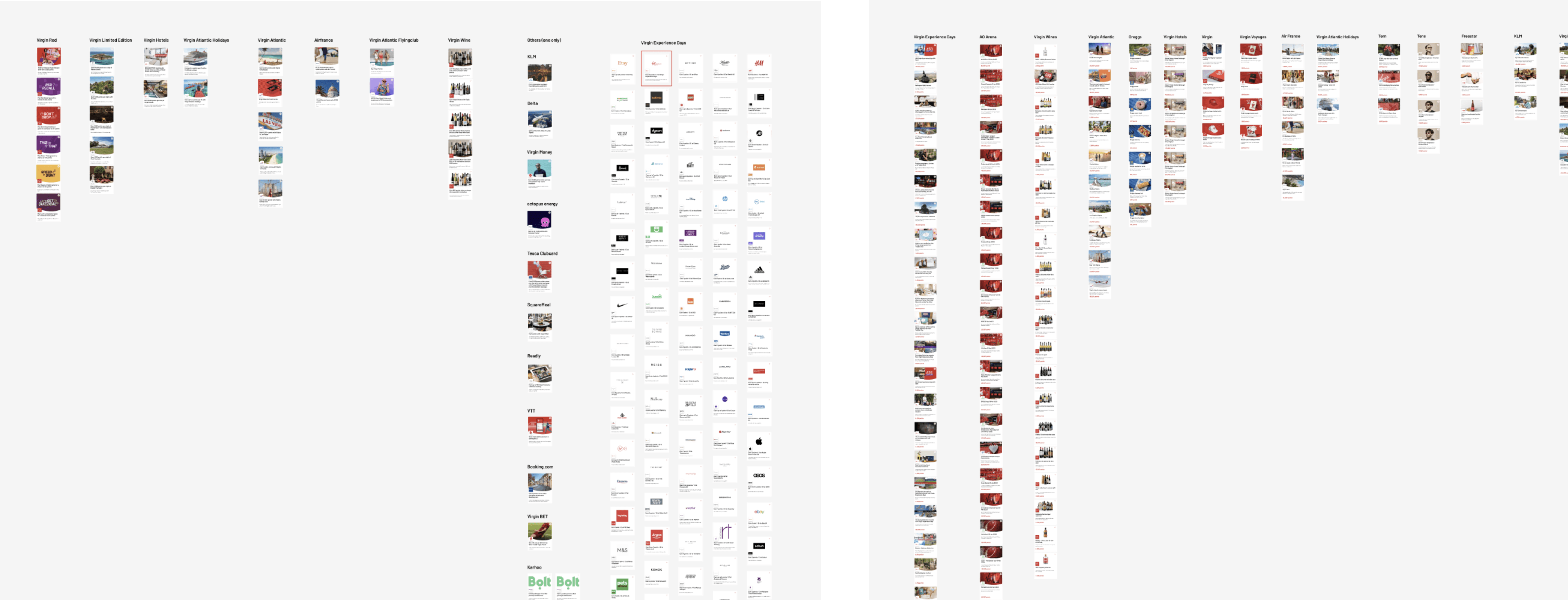
Analysing Brand Offerings to Prioritise Partners
To determine where to start, I evaluated the current offerings across different partner brands. This analysis helped identify key partners that aligned with both user demand and business impact.


Evaluating Individual Partner Pages
• To understand user needs at the partner level, we analysed individual partner pages.
• The findings revealed a mix of common and bespoke requirements, highlighting the need for a flexible yet scalable design approach.

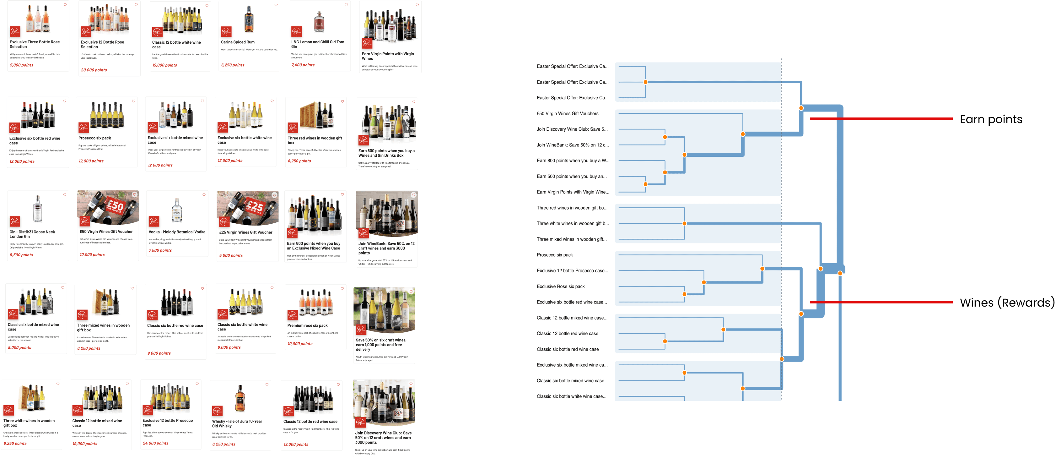
Open Card Sorting to Inform Content Structure
• To understand how users naturally categorise content on a partner page, we conducted an open card sorting exercise.
• The findings revealed that “Earning Points” and “Redeeming Points” were the clearest ways to structure content at this stage of the product.

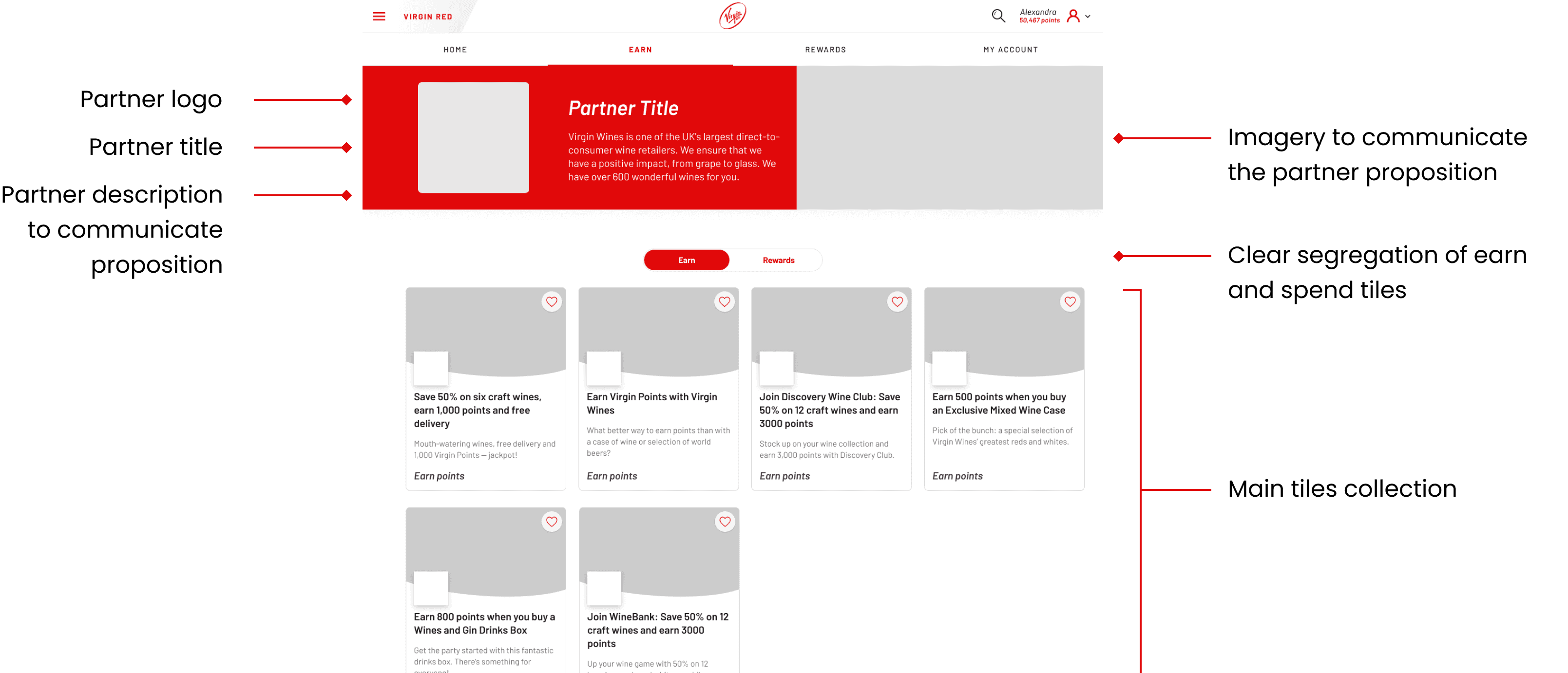
Design Approach: Balancing Consistency and Flexibility
• User needs varied across different partners, but a core experience was established by presenting images, logos, and descriptions for clarity and engagement.
• Current State: Content is structured into “Earn” and “Rewards” categories to improve discoverability.
• Future State: Introducing bespoke modules tailored to individual partner needs for a more dynamic experience.

Next stage and future vision
The future vision for the partner pages includes a more personalised and dynamic experience, with bespoke modules tailored to specific partner needs. This will further enhance content discoverability, user engagement, and overall satisfaction.

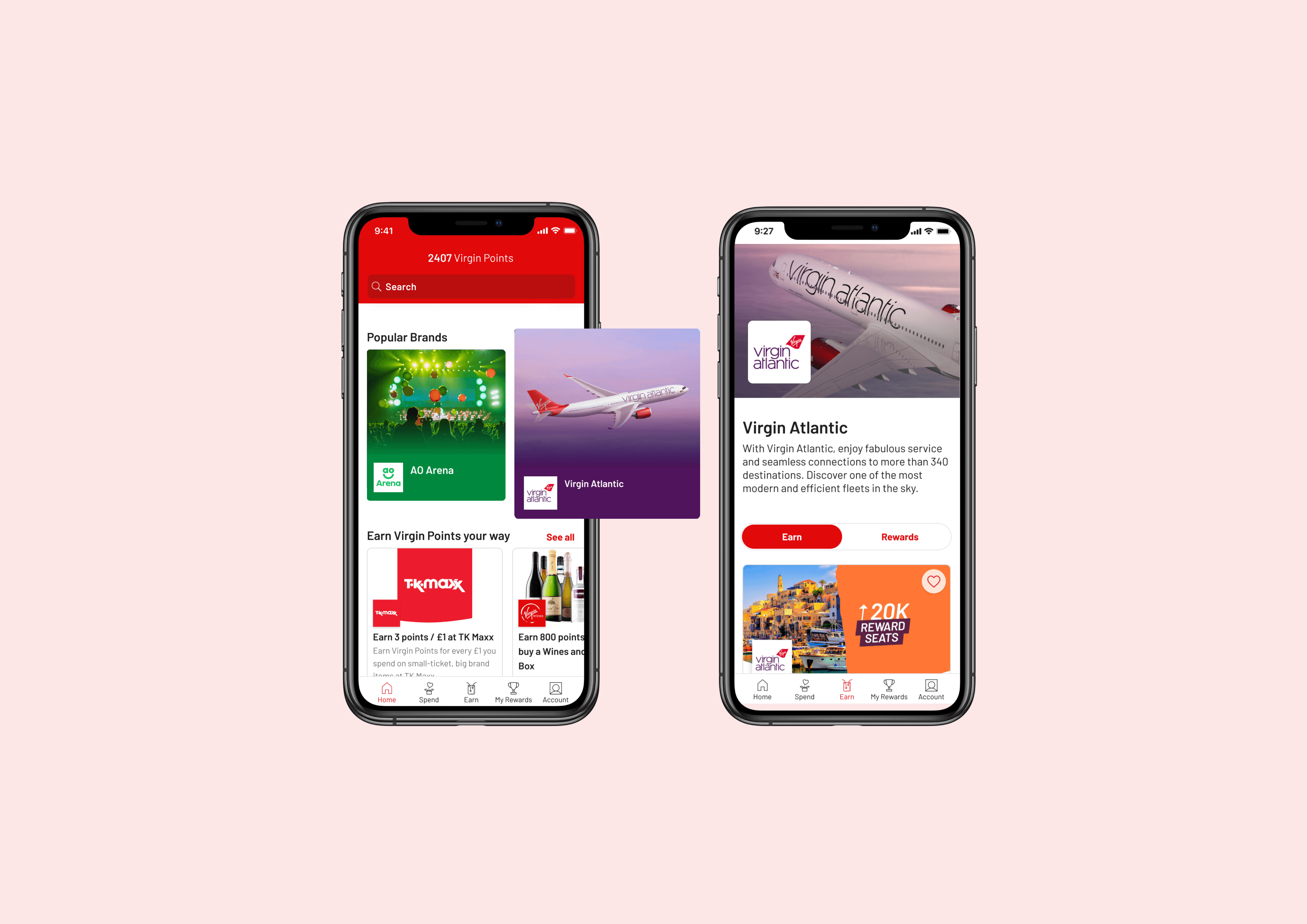
Entry Points and New Tile Structure
•To enhance discoverability, we identified key entry points to guide users to the partner pages.
• Additionally, I designed distinctive tiles that are easy to recognise and differentiate from generic tiles, ensuring a clear and intuitive user experience when displayed together.

Partner tile iteration
The design goal for the partner tiles was to:
• Clearly convey that the tiles represent a collection, distinguishing them from individual item tiles.
• Ensure scalability, aligning with the overall redesign of the tile system for consistency and flexibility.

Implementation Plan: Stages and Vision for the Future
The plan outlines the stages of implementation, with a clear vision for the future state. This includes a phased approach to designing and rolling out the new partner page experience, ensuring scalability and alignment with user needs.

Results
Improved Discoverability
• Both views and clicks of the tiles increased by 24% and 19% respectively, demonstrating enhanced user engagement.
Strengthened Business Partner Relationships
• Successfully launched 5 partner brands, elevating valuable partner content and improving exposure for users.
Long-Term Product Strategy Impact
• Set the foundation for future tile designs and broader partner and category pages, contributing to long-term strategic growth.
Learnings
Approach to Complex Contexts
• Leveraged a combination of research methodologies to inform a evidence-based approach, ensuring solutions were tailored to the complex needs of the product and its users.
