Year
2022
Product
Virgin Red loyalty web and app
Virgin Red logged out homepage for users growth

Re-designing the logged-out homepage and increase the acquisition of new users
Virgin Red was a new loyalty programme of Virgin in 2021. In the first two years of its launch, the business focused on acquiring new users. However, the first version of the homepage introduced pain-points to our users when they first joined. I initiated research and worked with the team to re-design one of the main channels for our product to acquire new users.

Target customers
Both Virgin and non-Virgin customers with different level of understanding of the Virgin companies and the brands - to accommodate different types of users
Aligning goals with business objectives
Increase number of users to 1.1 million
Increase engaged users, make sure they have the right amount of knowledge before they joined
Improve CSAT score
Problems of the current homepage
We conducted user research and identified issues with the current homepage. Analysing user behaviours on existing homepage. The users don’t understand what Virgin Red is and how it works.
This leads to low engagement upon signing up.

Defining design goals
Collaborate with stakeholders to align goals to improve user acquisition metrics. Including increasing sign up, increasing time spent on the homepage and reducing bounce rates
Revising information flow
We aim to guide users through key actions including signing up, explore our reward page and downloading the app, while browsing the content
Challenge
1. Communicate the evolving proposition of the company
Virgin Red is a new company within the Virgin Brand. The proposition of the programme is still evolving
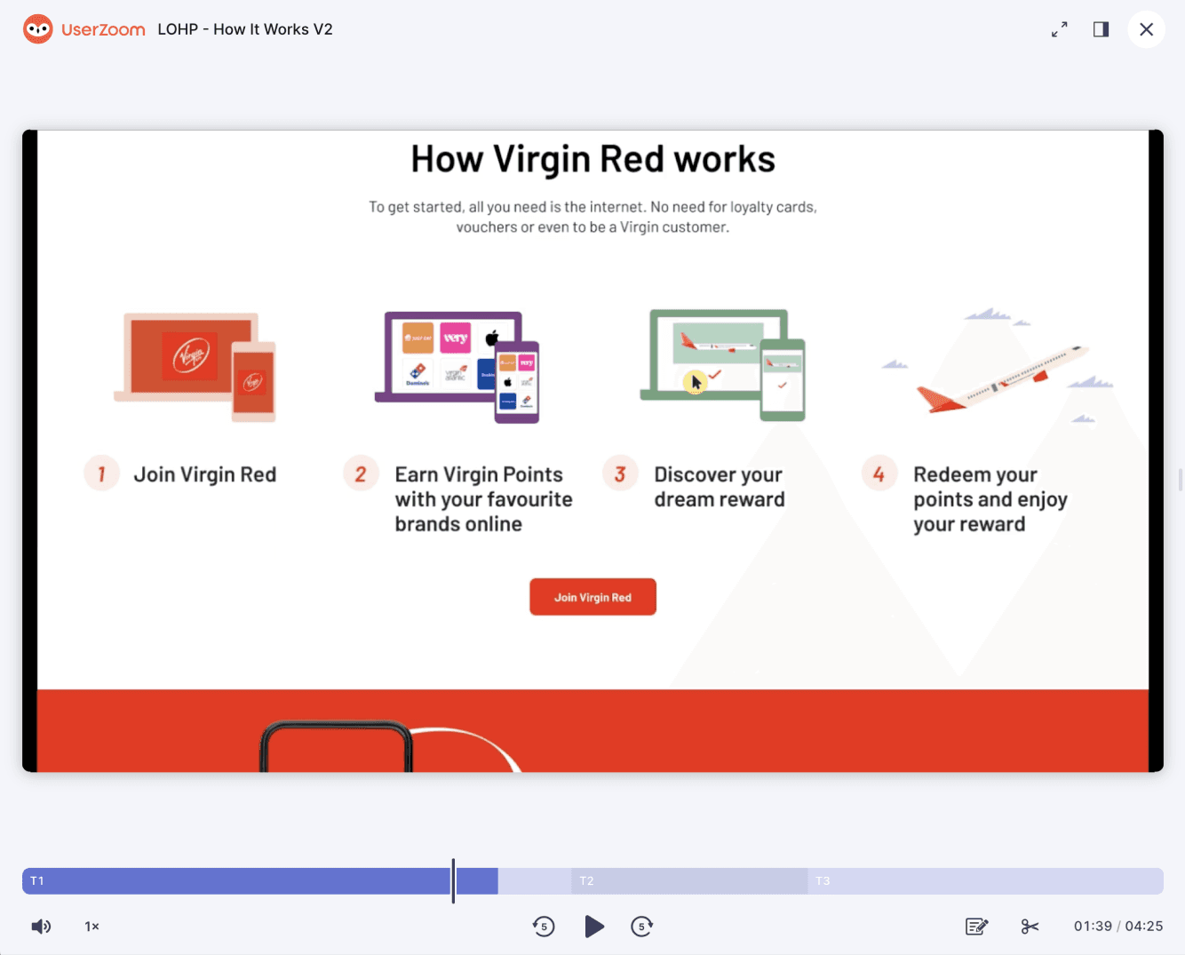
2. The journey of earning and spending points is complicated for new users
Some of the journey in the the programme is long and complicated. We need to give a high level overview and tell the users steps by steps on the detailsCommunicate the evolving proposition of the company
Virgin Red is a new company within the Virgin Brand. The proposition of the programme is still evolving
3. Branding
We work with the Brand team to create assets, colours and imageries that fit into the overall Brand strategies and at the same time, scalable on digital platforms
Design iterations
During the iterations, we communicate and align on the purpose of the page and coordinate different teams to make sure different sections on the page serve their purposes
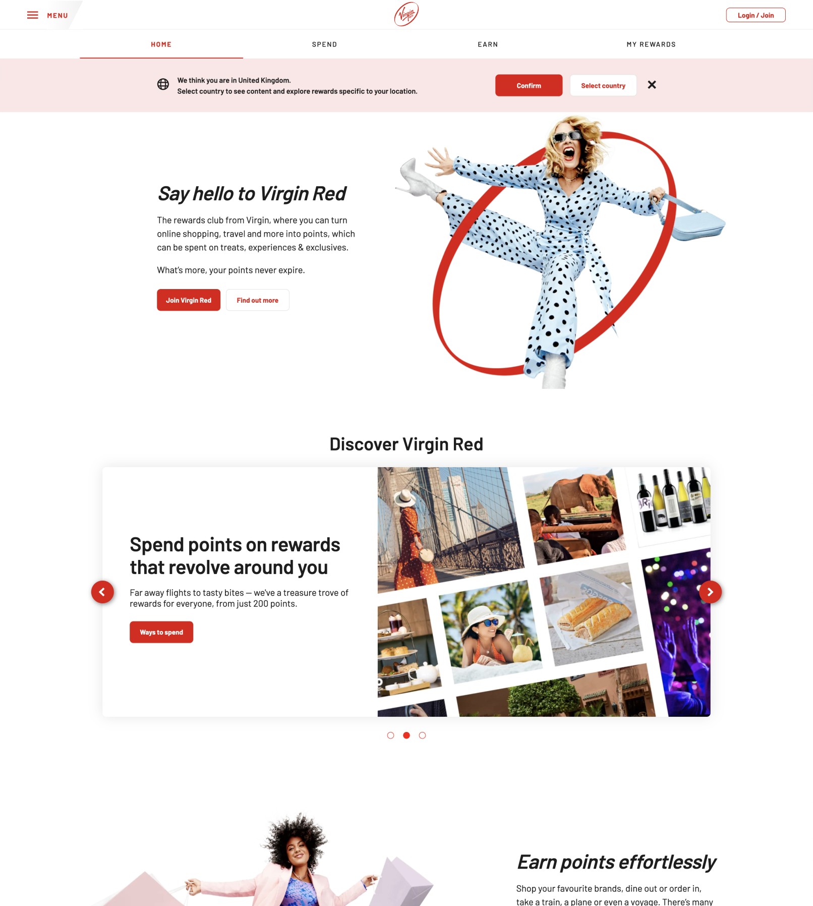
Header section
Insights: “Find out more” direct user out of the page
Purpose / Intent: Communicates the proposition of Virgin Red, highlights the benefits of the programme
How to earn section
Insight: User wants to see an overview of what brands are included
Purpose / Intent: Show examples of different partners so the users that feel they are relevant
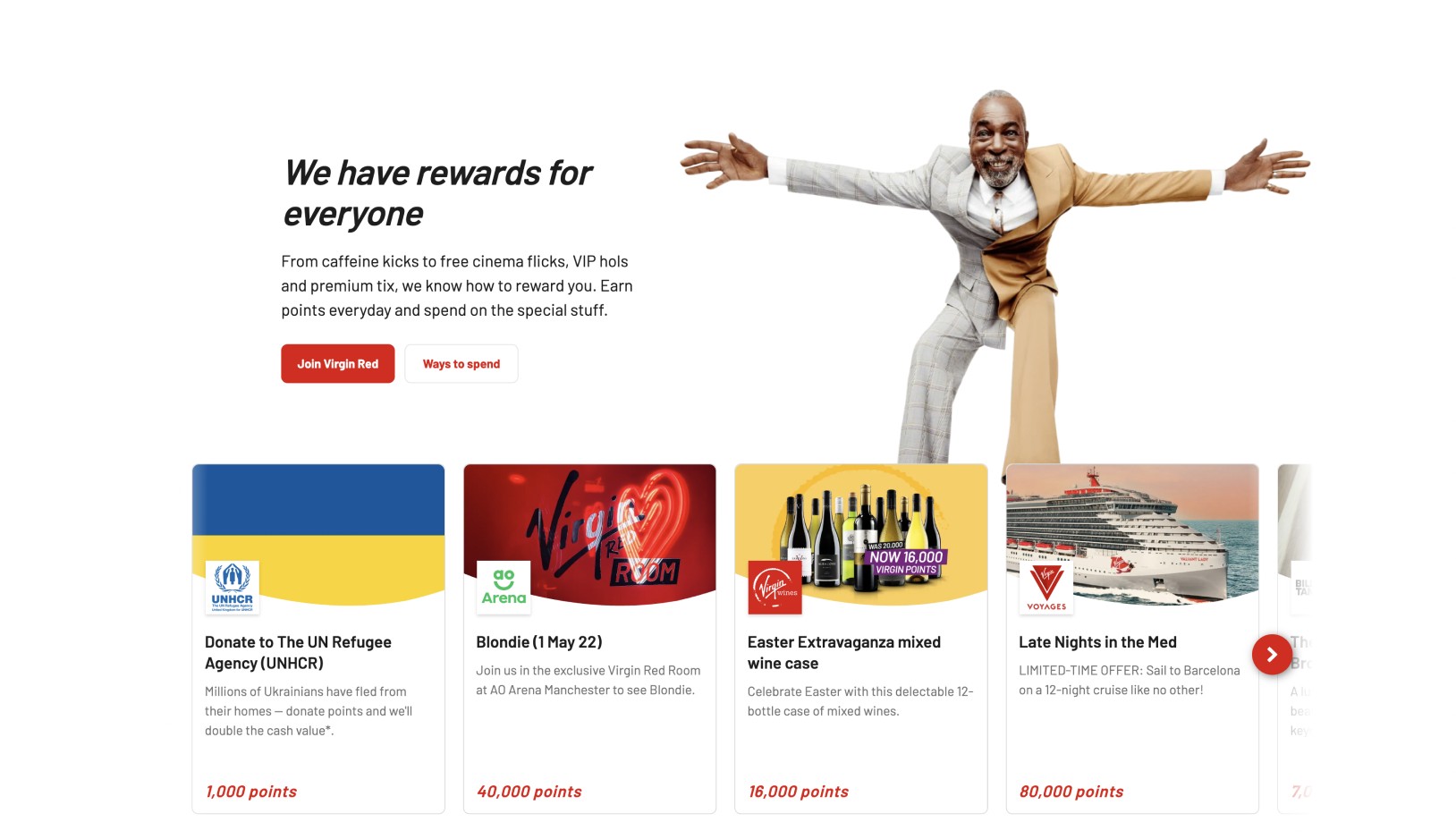
The section of “How to redeem rewards”
Insight: The layout limits the rewards to show, only 4 is visible
At this stage of the user journey, the users are more likely to skim through the page, so we need to expose content in a clear and concise way
The copy and upper image do not convey the idea of rewards and feel irrelevant to the users
Purpose / Intent: To show the breadth of Virgin Red rewards

Approach with individual rewards but present them with categorised tabs

Categories to show the large variety of rewards
Testing for the approach
To decide on a higher level of approach of how to present rewards and allow users to understand how to redeem rewards


Testing for comprehension
One of the problems we had was the copy and the comprehension.
To strike a balance between keeping the tone of voice of Virgin but at the same time convey messages that help the users at that stage of their journey
Results
Increase in Sign up
Increase conversion rate from 23% to 30%
Positive user feedback
Increase in CSAT score from 54% to 61%
User interview result - Users gain understanding on the proposition of Virgin Red and improve clarity on how to get started
