Year
2021
Product
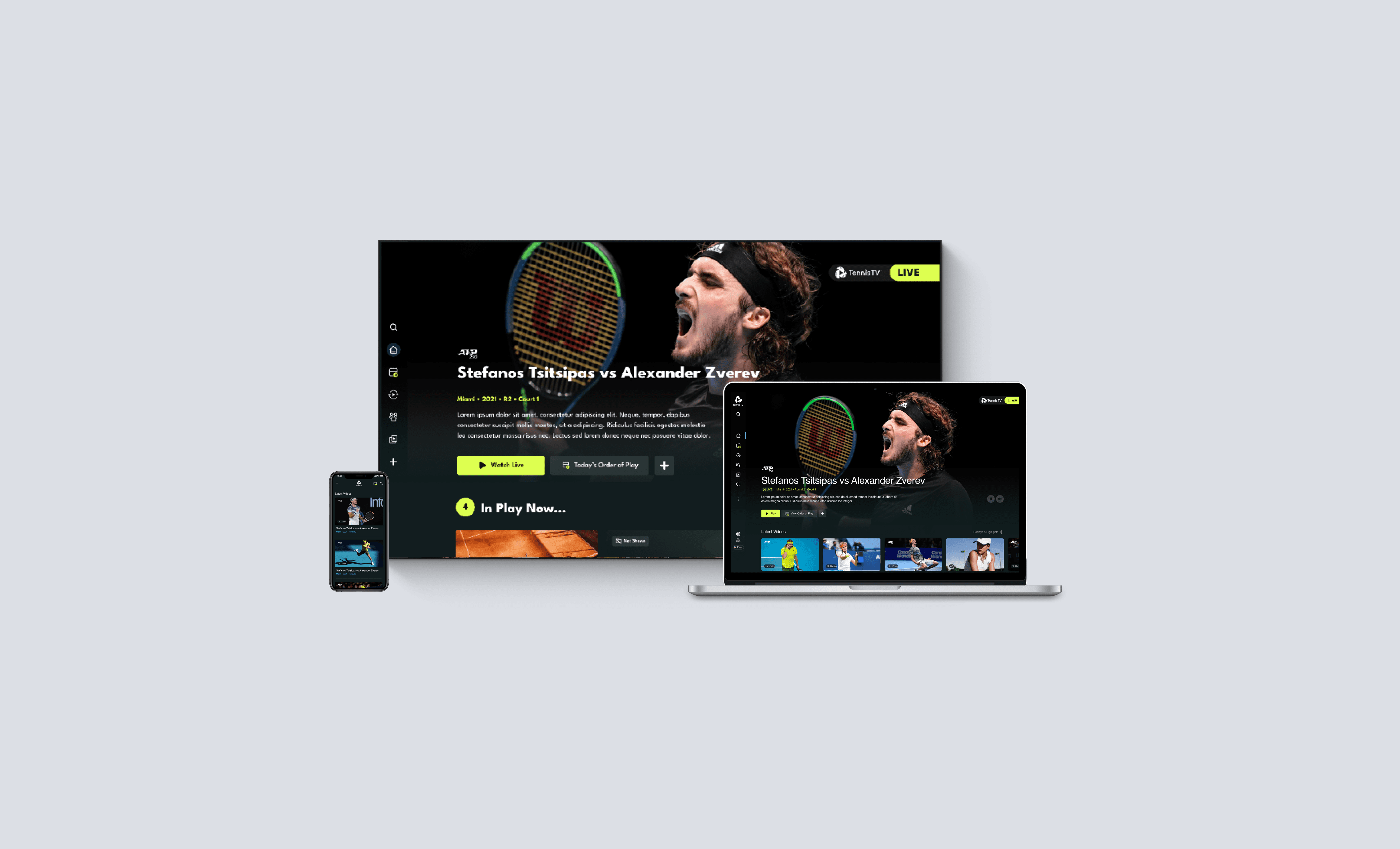
Tennis TV
Improving navigations on TV platform
Designing navigation specific for TVs and 10 foot Experience
Tennis TV is a subscription product for users to stream tennis matches. It is a cross-platform application available on TV, mobile and web. I worked with a cross-functional team to re-design the navigation of the TV applications. With a goal to improve the discoverabilities of content under the technical and interaction constraints of a TV experience.

The product has a hidden navigation and does not follow TV design pattern
Discovery
At the start of the project, we identified the goals and users' problems with the clients through various workshops
The business goals
• Increase discoverability of content
• Drive user engagement across platforms
Users problems
• Users find it hard to discover content
• Users find it difficult to navigate and get to the desired content

Improving TV navigations
The first task is to modernise the navigations on TV and reduce users’ effort in accessing content. By using a flat navigation, the time for the users to access content is reduced significantly

Design considerations on TV
• Navigating on TV is clunky and restricted by the d-pad TV remote control
• Interaction time increases with the number of clicks
• Missed opportunity to show content when users click through menu items
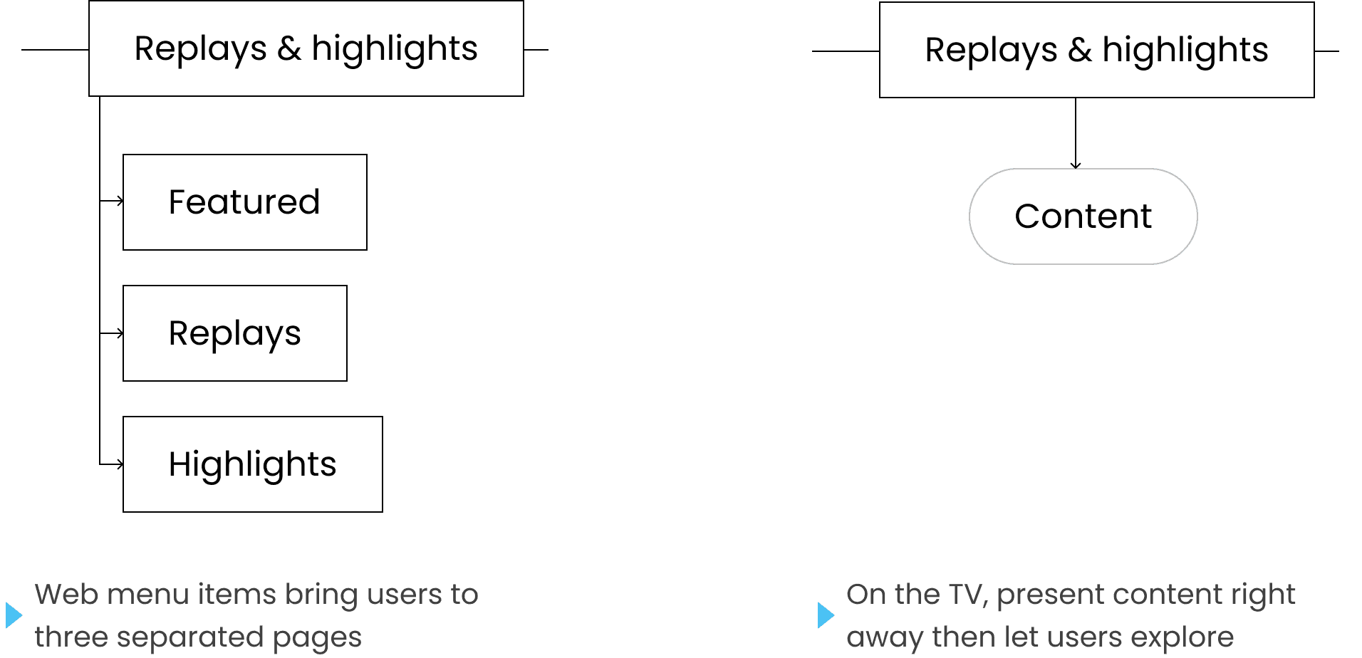
The navigation helps with accessing sub-items
Replays & Highlight
Improving navigation
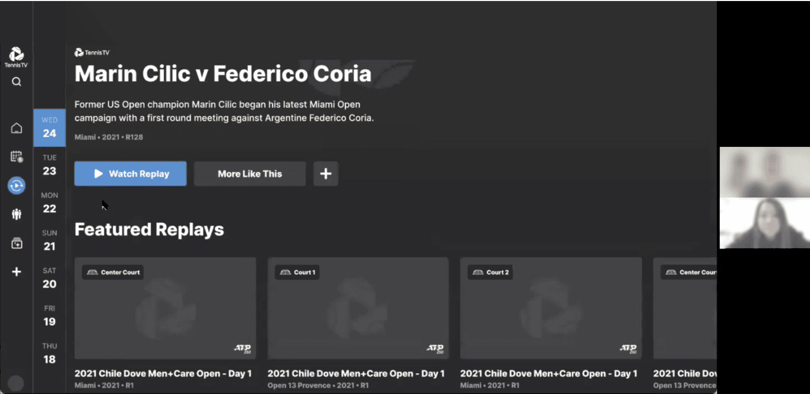
The purpose of the page is to let users watch match replays and highlight content easily
• 70% of active subscribers rated it as a top feature
• However, it suffers from low discoverability (Low click-through rate from home to replays & highlights)

Peak season - 96 matches in a day (Max use case)
Winter season and final - 1 match in a day (Min use case)
The goal
Optimise the layout for Replays & Highlights on TV for discoverability of content with different categorisations
The challenge
• The limitation on TV (tech and layout)
• The amount of content is not consistent - peak seasons and tournaments

Design iterations
Iteration 1 - Category cards
Pros
• Exposing the categories that are available and gives users details through meta data
• Big tiles draw users’ attention
• Quick navigation through remote’s ‘ENTER’ and ‘BACK’
Cons
• Deeper navigation, more steps in accessing the matches
❓Discoverabilities ✅ Relevancy ✅ Technical constraints

Design iterations
Iteration 2 - Expose matches with categories filter
Pros
• It follows the pattern that is allowed by TV navigation
• Quick access to matches through the filtering
Cons
• Some tournaments might have only one video on a day, the amount of videos available is hidden
• Old TV might have issues updating the tiles
✅ Discoverabilities ✅ Relevancy 🚫 Technical constraints
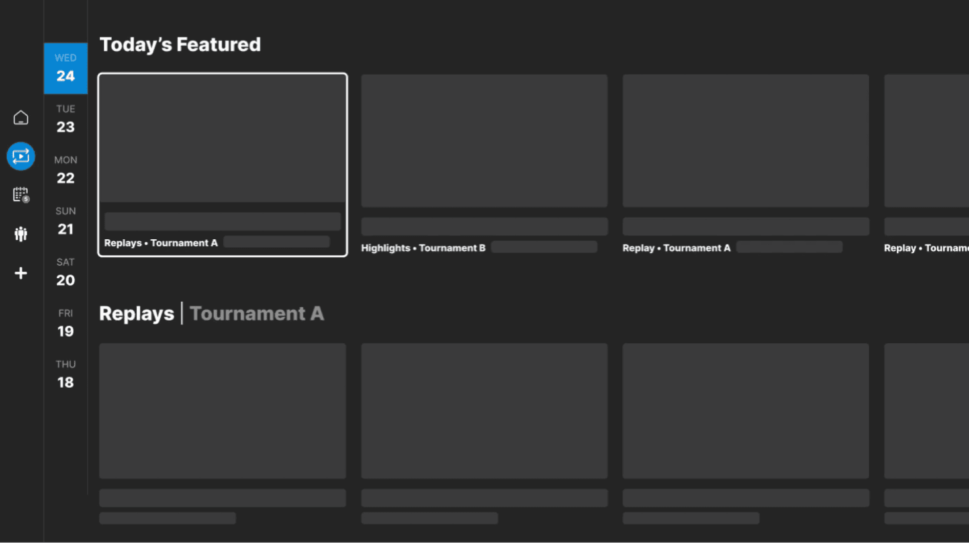


A featured block is added to show the recommended content on the top
Stress testing with users by adding multiple tournaments to make sure the users can still navigate through different matches when the page is long

TV Design system
• Expanding the library of web and made adjustments for TV Devices
• Focused state
• Colour saturation
Results
• Reach to the content quicker
• Relevant content in order
• Clearer categorisations
Project outcome
Discoverability
• The average time for a user to discover and find a piece of content at replay reduced from 15s to 5s
Next step
• Automation to aid editorial teams - Preset ordering with popularity of tournaments, based on page views and analytics
• Optimisation strategy for older devices, so more advanced features can be used on newer TVs